ecobox: design frontiers 2026
Design Frontiers is a annual design-a-thon hosted by UCSD's pre-professional design club, Design Co. This year, it's theme was "design a solution to fix what everyone has accepted as broken." In our response, with only 24 hours from start to finish, we decided to tackle climate change on an individual level. Leading us to
problem statement
How might we motivate individuals to implement environmental sustainability into their daily lives?
elevator pitch
Ecobox is a mobile app and service aimed at reducing an individual’s carbon footprint and encouraging environmentally conscious day-to-day living. Partnering with donation centers to verify user honesty, the app incentivizes users to donate less conventionally recycled used items (clothes, appliances, electronics) in exchange for fun, digitized characters and monthly packages of ‘snail mail’ dedicated to those characters.


user research
Research by Friends of the Earth found 70 percent of 18 to 24-year-olds are eco-anxious. Individuals, especially youth are losing faith in the ability of individuals to combat climate change due to the power of institutions.
To attack our problem statement, we conducted user research by creating an intuitive survey.
Our survey showed a high interest in recycling and donating, particularly clothes and bottles/cans. However, since recycling bottles/cans can easily be done by throwing them in local bins, we looked into other high-demand donations. Research from recyclingtoday.org highlights that electronics and appliances are often donated, but difficult to recycle in the traditional recycling bin. Based on this, we decided to focus our app on clothing, electronics, and appliances.
Additionally, we also surveyed what kinds of incentives users would desire the most in return to recycling or making sustainable decisions. The most common answer to this was “money,” or other tangible objects; something that people could have and potentially use.
This signifies that users would prefer to have a physical representation or value to their supposed “sustainability level” or habits. We decided to give back “snail mail” and in-app “blind boxes” as an incentive to donating one’s unwanted recyclable items. These digital characters and physical, fun mail can serve as the users tangible sustainability level.
comparative analysis & initial design


After gathering research and responses, we set out mood boarding and finding similar apps. Because the youth were such a driving factor, we focused on friendly visuals, combining a tamagotchi-type style with little creatures as a motivating factor.We especially liked Pikmin Bloom and Pokemon Go’s single main screen, with other pages available from a singular button. Because we wanted the user to immediately be able to see the impact they have made (a response from the Google form that described a motivating factor to donate), we wanted the information to be the main highlight, and a singular home screen would help in narrowing down that information visually.
Narrowing down the ideas from our mood board, we created a design system that focused on approachable designs, including colorful imagery that would make the process of using the app more enjoyable.
Upon solidifying a creative vision, we set to work, sketching out initial ideas for the app.
From there, we found common themes and ideas that we liked, and starred our personal favorite features, ensuring that the designs we curated had elements from all of our visions.
Screenshots of our comparative analysis, initial screen ideation, and design system (from left to right
initialization
1. finding driving inspiration
2. prototype general layouts
3. finalize visual identity

lofis & hifis
After a round of critique for our lofis, we moved onto our hifis. Here, we focused on stressing impact and creating an enjoyable process.
Here, we ran into an initial challenge: how would we incorporate all the metrics for what the user has saved alongside making it visually appealing?
Upon a few iterations, we settled on adding the information onto the home screen, allowing for the user to immediately see their progress and what they’ve contributed as so there’s an initial rewarding feeling as they progress through the app, combined with appealing imagery and animation to keep the user’s attention.
Screenshot of our lofis
-
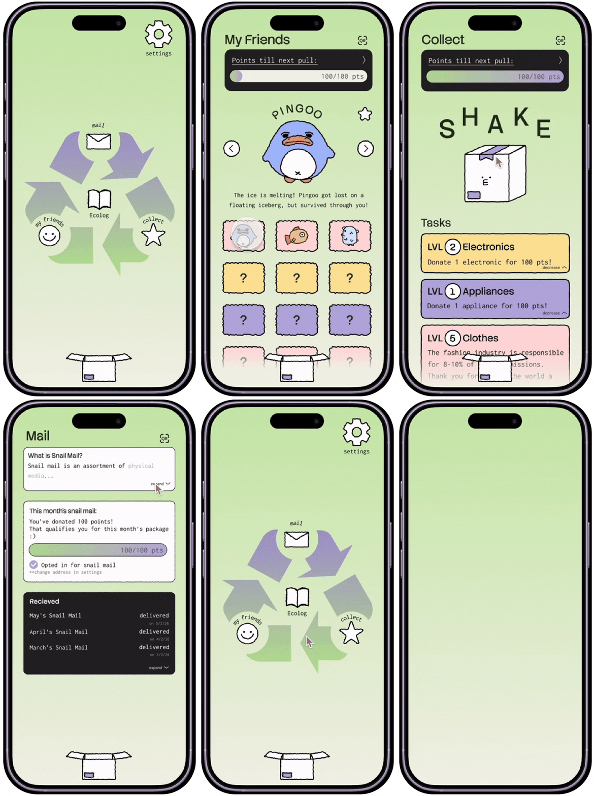
Home Page: The user can see the material impacts of their sustainable habits and an overview of those habits.
-
Inventory: The user can view the collection of characters they’ve accumulated.
-
Scan: Users can go to partnered donation center locations where the staff will scan their personalized QR code and verify their donation for the app.
-
Collect: The user can see their progression in each of the categories for donation (clothing, appliances, electronics. After reaching the quantity threshold for point collection in a category through donating to one of our partnered charity locations, these points will go towards the ‘points until next pull’ of a character and the ‘points until qualification for this month’s package’ (snail mail). The user can click on the box to pull for a new random character once they’ve met the requirement.
-
Mail: The user can opt in/opt out of snail mail and view the status/history of the packages that EcoBox has shipped to them. Snail mail features a assortment of physical items (keychain, print, postcards, stickers) for a randomized character from the user’s inventory.
-
EcoLog: Everyday will feature a new environmental task along with an environmental fact related to the task. The user can take a photo of them performing this task and this photo will be added to their photo diary. Through the diary, users can easily access a visualization of their efforts towards sustainable living.
user journey


Screenshot of our hifis
final thoughts
What we’re proud of:
We are especially proud of making this app as educational as it is engaging. Besides donating and recycling, users can explore the realities of climate change and its impact on innocent wildlife through “friend” backstories and fun facts. By gamifying the experience, we’ve ensured that users stay informed while enjoying the process of collecting new “friends” and tangible things like vinyl stickers from “snail mail.” We are happy to bring home 3rd in Design Frontiers 2026!
Challenges we ran into:
Upon receiving judge feedback in the last hour of the event, we realized that our initial idea of having the user send in their packages to the company would be both strenuous and redundant. As shipping costs would have to be settled by either the user or the company, there would be extra costs that the user nor the app would necessarily want to cover. Shipping is also not the most sustainable option, so in that sense, our efforts to reduce or promote individual climate action would be reversed. With only an hour left, we decided to confront and solve this issue. We settled on and implemented a QR code that could be scanned by second-hand stores when dropping of donations, that would in turn verify the package and give points back to the user. In this way, the user nor us needs to cover shipping costs, and donating becomes as simple as dropping your goods off at a donation center.
What’s next:
EcoBox will seek to partner up with interested second-hand stores, allowing the user to be able to readily access sources where they can be rewarded for their donations. Upon launch, the goal is to get as many people incentivized to start donating using the concept of blind boxes and social currency, and help contribute to the fight towards climate change.


tokens magazine vol.2
Tokens Magazine is a fashion, art, music, literature, and culture magazine at UCSD. Each year, they release a new volume, each having its own specific and unique theme. This year, the theme revolved around the idea of "fika", which is a Swedish social ritual that focuses on coffee breaks that are more than just a break. As a member of the art team, my role is to design and create pieces that reflect my personal interpretation of the theme. However, my role also expanded to collaborating with other teams, namely the photography and styling teams. After their "fika" photoshoot and their design pitch, I reached out to them in hopes of being their graphic designer for their pitch, to which they accepted. Working with a Pinterest board, pitch, article, Adobe Illustrator, Adobe Stock, Canva, and a dream, I created 4-page spreads that ultimately reflected the team's idea of fika, the concept of girlhood. I learned to piece together pure ideas and conceptual photos into a workable magazine layout that effectively encapsulates "girlhood" as a whole.


fikafikafika


climate action initiative


In my climate action writing class at UCSD, we were prompted with the question, "How do YOU communicate the climate crisis?" Thus, for my final project, I chose to create posters. But, instead of focusing on the economic or social aspects of the crisis, I wanted to emphasize the small things our community can do to prevent the spread. College-aged students were my main demographic, and I
wanted to challenge myself to communicate my intentions to students and, second, to create visually-appealing posters that one would actually want to stop and look at, and hopefully make that change.
how do you communicate the climate crisis?

wolfpack press
.png)
The Wolfpack Press is a student-run organization at Mission Vista High School that publishes an annual magazine reflecting both the selected theme for the academic school year and current trends within and outside the campus. As the selected artist for the cover design, I worked collaboratively with the editorial team, in addition to the printing supervisor, to accurately reflect the year's theme, growing naturally with the beauty of nature.

1. Create a visual mock-up
the process
3. Edit, revise, finalize, repeat!
2. Send to editorial team for review
1. Create a visual mock-up
.png)

